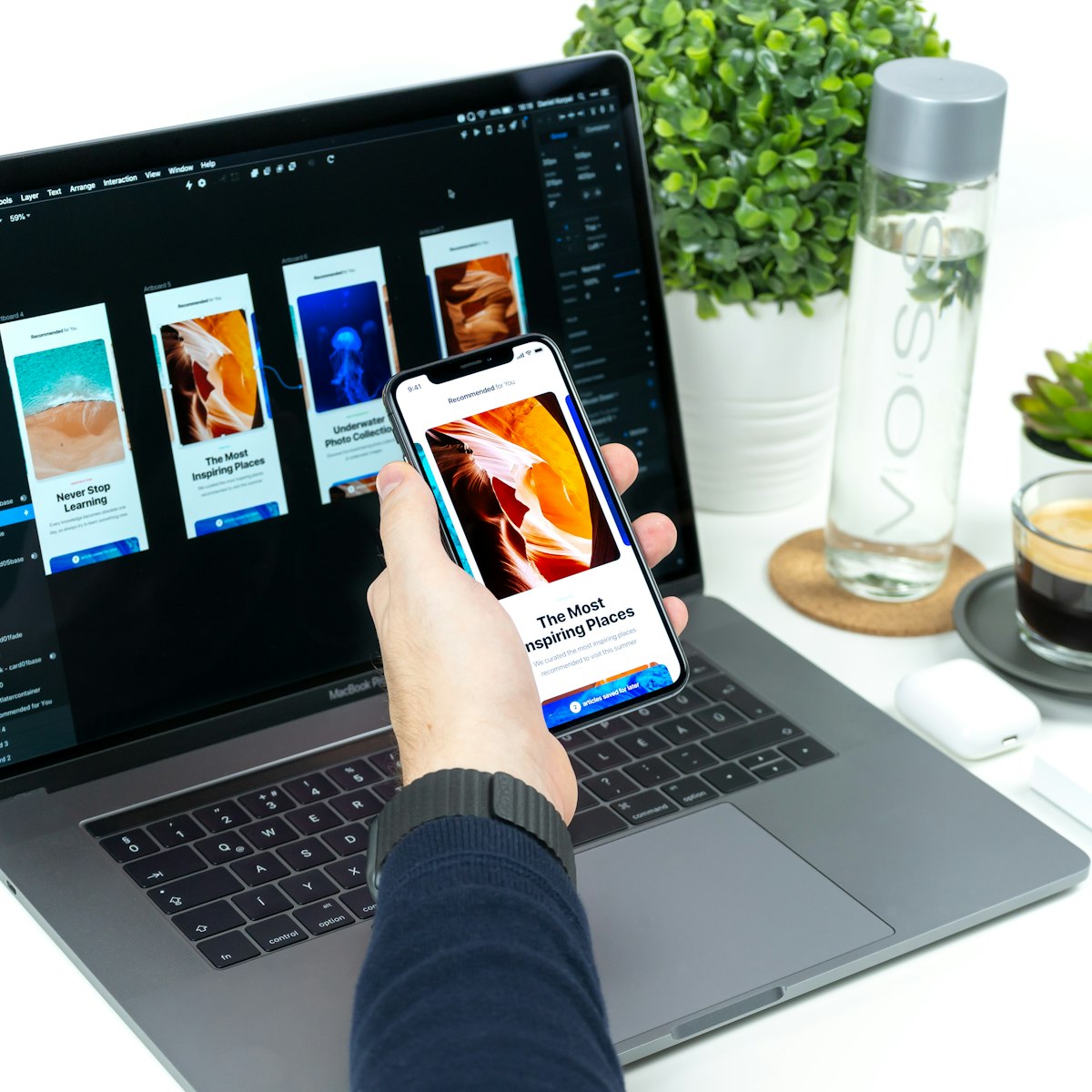
Mobile-First Design in 2026
Over 60% of global web traffic comes from mobile devices. Google uses mobile-first indexing. If your website isn't optimized for mobile, you're invisible to the majority of your potential customers.
What Is Mobile-First Design?
Instead of designing for desktop and then adapting for mobile, you design for mobile first and then enhance for larger screens. This ensures the mobile experience isn't an afterthought.
Key Principles

Touch-friendly: Buttons and links minimum 48px tall. Adequate spacing between tappable elements. No hover-dependent functionality.
Readable without zooming: Body text at least 16px. High contrast between text and background. Short paragraphs and scannable content.
Fast loading: Mobile users are often on slower connections. Compress images aggressively. Minimize JavaScript. Use lazy loading for images below the fold.
Simplified navigation: Use a hamburger menu for main navigation. Keep the most important actions visible (phone number, CTA button). Sticky headers with key actions.
Testing
Test on real devices, not just browser dev tools. Check iPhone, Android, tablet, and different screen sizes. Test forms with thumb-only input. Check load times on throttled connections.